 |
| License this image here. |
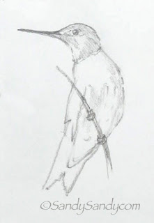
I've been doing some little watercolors from my hummingbird sketches. When I do the pencil sketch, I normally use a soft (3B or 4B) pencil and a light touch on Strathmore 300 Series Drawing paper in a spiral bound pad. Tip: Remember to squint! It is an extremely valuable aid in drawing and painting. It allows you to see shapes and values more easily without getting too caught up in the details.
I trace my drawing onto 140 lb. Arches watercolor paper using my light box. If you don't have one, just tape your sketch to a window and trace with a light line. When transferring the image to the cotton paper, I normally use a broken line and a hard (2H or 3H) pencil with a light touch. Don't press too hard or you'll score the paper.
I also repainted that hummingbird in flight for the third time and posted it on my web log today. There are still a few things that I'm not satisfied with, but I feel this last one is good enough so that I can move on now.
"With ordinary talent and extraordinary perseverance, all things are attainable." ~ Thomas Foxwell Buxton


Beautiful and I do love that little extra the spattering does for a painting. I keep forgetting to try that.
ReplyDeleteForgot to ask.......What color are you using for your reds and greens? I love them!!!
ReplyDeleteSusan- I always use a mixture of pigments and create my own hues. The green is a combo of cadmium yellow, Ultramarine Blue and a touch of phalo and olive green. The red is rose madder, cad. red med. and a touch of Ultramarine blue. I also used a little black, yellow ochre, naples yellow and burnt sienna. I pre-mixed enough colors in a little round palette for this series as I wanted them to all match.
ReplyDeleteBeautiful mixes. I don't have all of those pigments but will try those I have that might come close. Those colors you achieved are gorgeous. Red is a difficult color for me to get right that I personally like. Same with violets. Violets always look dingy to me (that I mix) and that's using the right color bias combos. Maybe it's just my choice of actual pigments. Will have to play with that too. Thank you for sharing your palette.
ReplyDelete